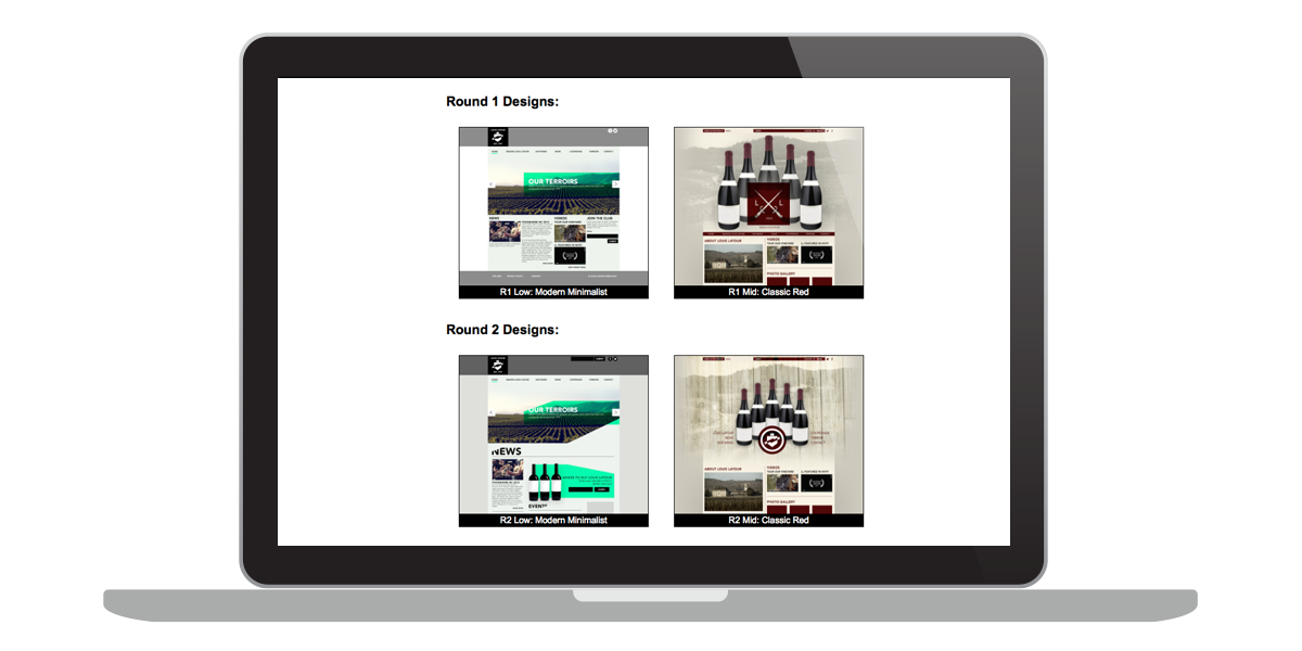
Comp Sites
An Interface for Client UI Mockups
by Chris Gargiulo
One of the easiest and most effective ways to share user interface (UI) mockups for client review is a simple comp site. A comp site is basically a set of html pages designed to qucikly and easily display a series of UI mockup images inside of the browser in a manner that ensures that the image is displayed properly across platforms and browsers. The goal is to present the UI designs quickly and easily while reducing the risk of client confusion.
A "comp" (short for comprehensive) is a term that many companies use to refer to visual UI designs created for client approval prior to development. Comps are typically flat (image) mockups created in Photshop or Illustrator designed to communicate potential visual design directions and UI styling. There are many different ways to share a UI mockup with a client. They can easilly be emailed as attachments or posted online with urls to the image itself. However, this aproach gives the designer little to no control over how the client will view the jpg. For example, some browsers might auto-shrink images to fit the browser window by default, while others may not. Some might auto-center the image, while others might left-align them. If your client is web savvy, they might be able to see past these display issues and focus on the UI design itself, but if your client is not, they might get confused. Anohter common example: a client might think that the typography is too small to read if they are not viewing the mockup at 100%.
To avoid these problems and to help minimize potential confusion, a comp site is one way that could help to ensure that the client will see the UI design exactly as the designer wants it to be viewed inside of the browser. By placing the image inside of an html document, the designer can quickly add minimal styling (CSS) to make sure that the image is displayed properly across platforms, devices, and browsers. There are many ways to do this and there is no single right or wrong way, but a few quick and simple techniques might be easier and faster to implement than others. Regardless of the techniques employed, the goal is the same: to present UI designs quickly and easily in a manner that reduces the risk of client confusion.
Coded Demo:
 Coded Demo
Video Lesson:
Below is a video lesson demonstrating one way to create a simple comp site.
The Comp Site Step-by-Step Process:
1. Gather UI Images
- Save out your UI mockups in a web friendly format such as jpegs, gifs, or pngs.
2. Create HTML files
- Place each imagen in its own html file, either inline (directly in the html) or via CSS (as a background image).
- Position it via CSS.
- Consider adding any repeating UI background images.
- Consider making it linkable to the next UI mockup in the sequence that you want the client to view them.
3. Create an Index
- When presenting multiple UI designs, it is often times helpful for clients to be able to visualize the full set of designs as thumb images. A simple index page with linked thumb images is an easy and efficient way to do this.
- Be sure to add text labels to identify each mockup.
Exercise Files:
Conclusion
One of the easiest and most effective ways to share user interface (UI) mockups for client review is a simple comp site. The goal is to present the UI designs quickly and easily in a manner that reduces the risk of client confusion.