Portfolio Entries
Presentation Considerations and Options When Preparing Design Projects for Portfolio Display
by Chris Gargiulo
Designers often times go to great lengths to meet project deadlines and spend hours trying to properly address and accomodate the needs and requests of their stakeholders (clients, users, target audience, etc.), but how many can say that they an appropriate amount of time and attention to accomodate their most important stakeholder: themself? One way to reward yourself is to update your portfolio, as if you are the client.
Once the last deadline has been met and the final deliverable sent, designers sometimes choose to avoid opening old project folders and files for weeks, months, and sometimes years. Portfolios can become frozen in time if not updated periodically. It is often times easier to move on to the next project than it is to clean up yesterday's mess. It's time to dust off those folders and spend some quality time thinking about the most important client: yourself, and arguably your most important project: your portfolio.
Primary Things to Consider:
- Should this project be in your portfolio? Or is it best left unseen?
- Do I need both a print and online version? Isn't this twice as much work?
- For the online version, should I use a third-party portfolio solution to share my work?
- How much info do I need to prepare/provide for each project? Final images/renderings only, or should I include process images? Should I write a short summary or a detailed case-study?
Secondary Things to Consider:
- What's the best way to stage my work across different media (apple device mockups for UI designs? Studio-lit photographs for printed media? Animated gifs for motion graphics?)
- Should I put them into catergories based on media? What should the category names be? What if I have too many in one category and not enough in another? What if a project falls into multiple categories? Do I split them into seperate medium-entries or group them by client?
- What are the best UX design patterns for the user to view/experience my portfolio? A grid of thumb images that launch modal windows? Featured carousels that users can view by swiping left to right? Dedicated pages with a series of images stacked on top of one another viewed by scrolling a vertically?
- Should I accurately share the final project "untouched" as it was sent to the client, or am I allowed to "touch it up" with a few cosmetic upgrades?
- What about all of those discarded designs that the client/creative director rejected (and you loved) - can I still include them in my portfolio?
How am I going to figure out the best approach for me? Try using the design process.
The Rules Are: There Are No Rules
There are no industry standard rules for how to best present a portfolio, therefore there are no right or wrong answers to each of the above stated questions. The answers often times subjectively lie with each designer, who's decisions will ultimately reflect their personality (and design skills). Great. "It Depends." That doesn't help me at all. How am I going to figure out the best approach for me? Try using the design process.
A modified 5-step Design Process for Portfolio Entries
- Consider your audience.
- Who is this portfolio for? A prospective employer? Then cater it to them.
- Consider creating several different portfolios that are context-based for different audiences.
- Tell a good story
- Don't just show us the final project, tell us a story.
- What makes a good story? Consider the traditional 3 act structure for dramatic narratives: start with an inciting incident (the primary design problem), lead us through the obstacles faced and individual challenges that you overcame (your design solutions), then go out with a bang (the climax) with a happy ending and resolution(final renderings).
- Consider multiple designs
- If you can't decide between any two options, try them before you decide. Found mockups or custom photos? Raster or vector mockups? Module window or vertical sets of images? Brief summary only or detailed case-study? Try them all and test them out.
- Create multiple versions and prototypes
- For a print portfolio, be sure to print it on different paper, bind it and feel it in your hands. Don't wait until the last minute to hit print.
- For the online portfolio, be sure to code it, post it, and view it from multiple screen sizes and devices. Don't take a guess at what the UX will be, code it several times and different ways if necessary. Experience the product as a user and weigh the pro's & cons for each coded prototype.
- Be Consistent and Be Honest
- Once you have figured out and created several entries, be sure to maintain a standard of quality across all portfolio items. If any projects fall short, consider whether or not to improve them or cut them.
- Get an editor/ask a friend that you can count on for honest, objective feedback. Soliticit critical feedback early and save the sugar-coated "likes" for after the launch.
Visual Examples of Options to Consider
-
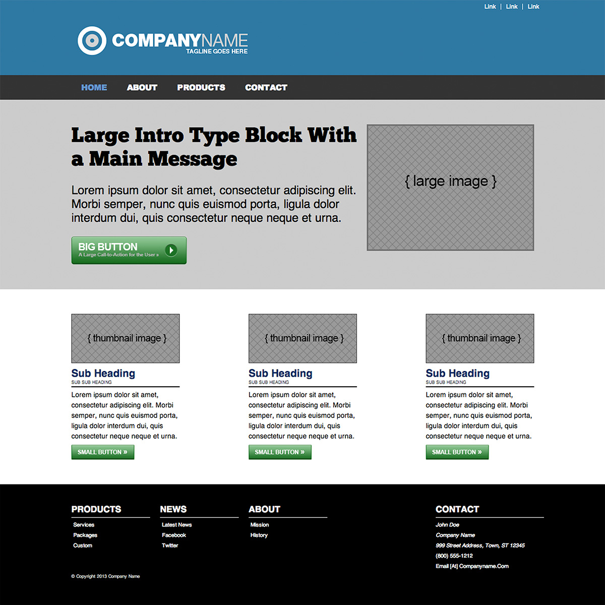
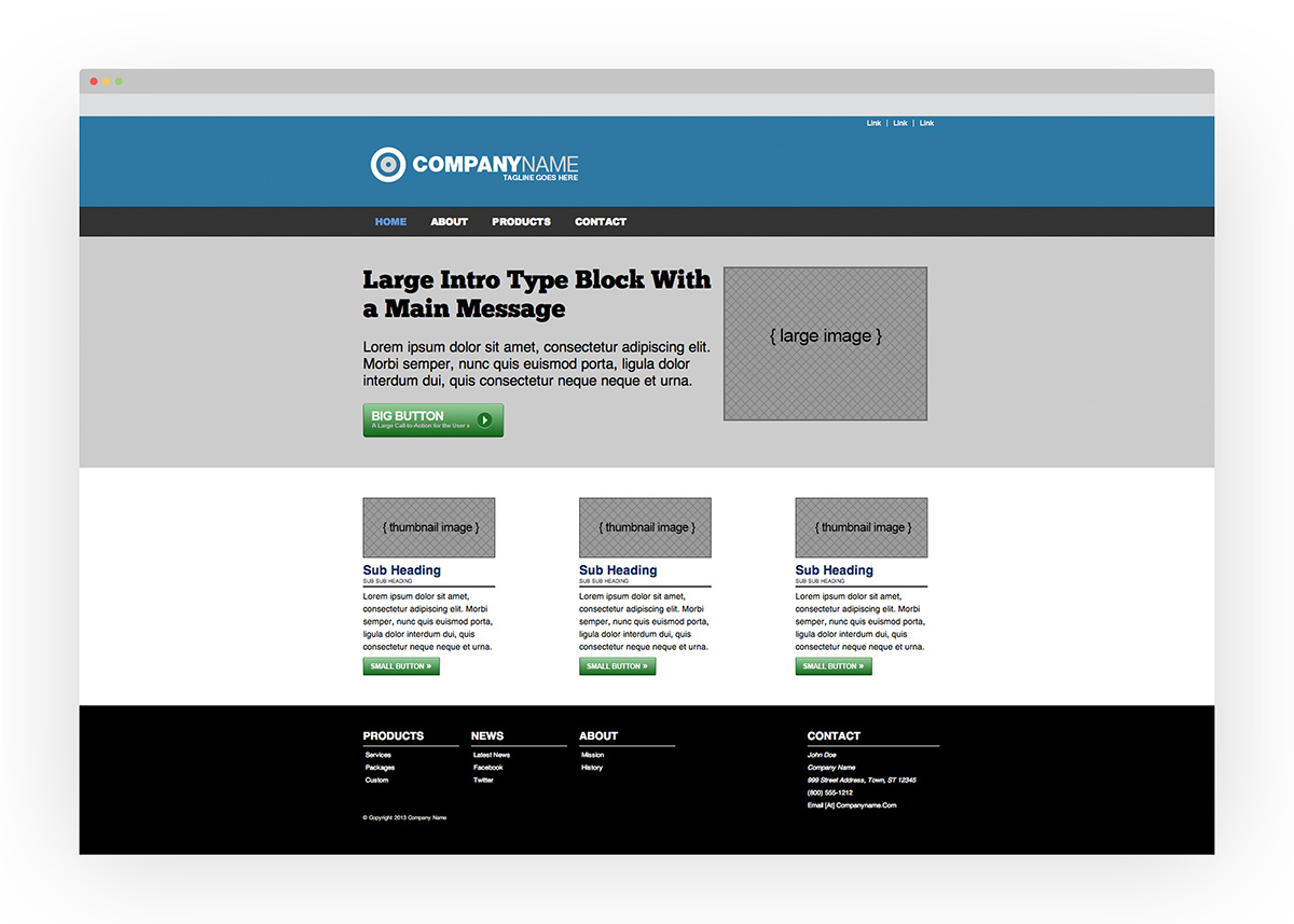
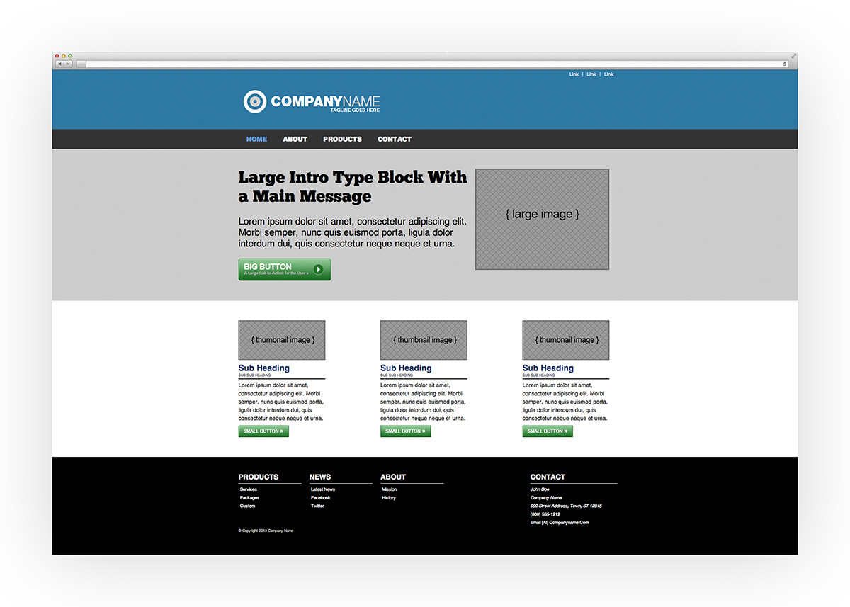
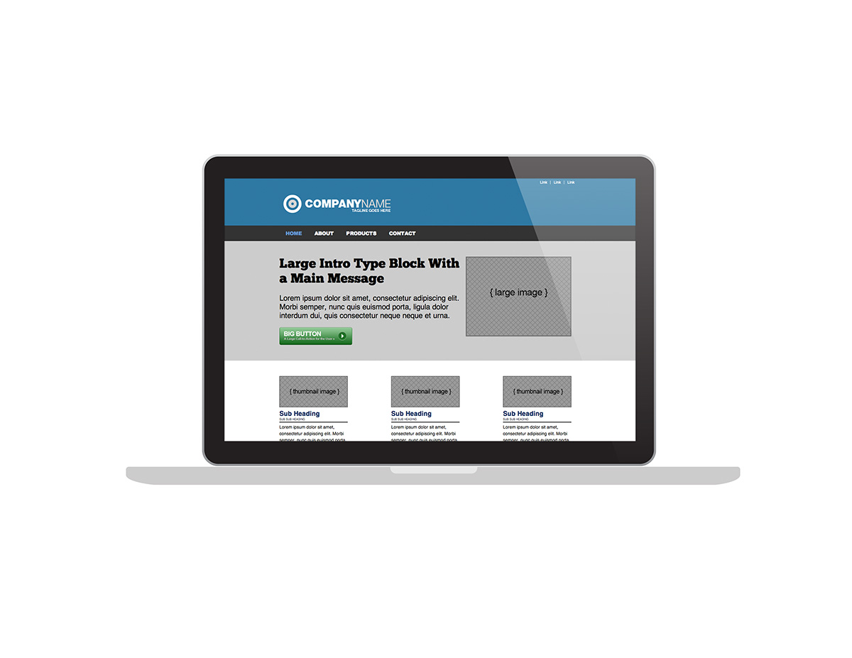
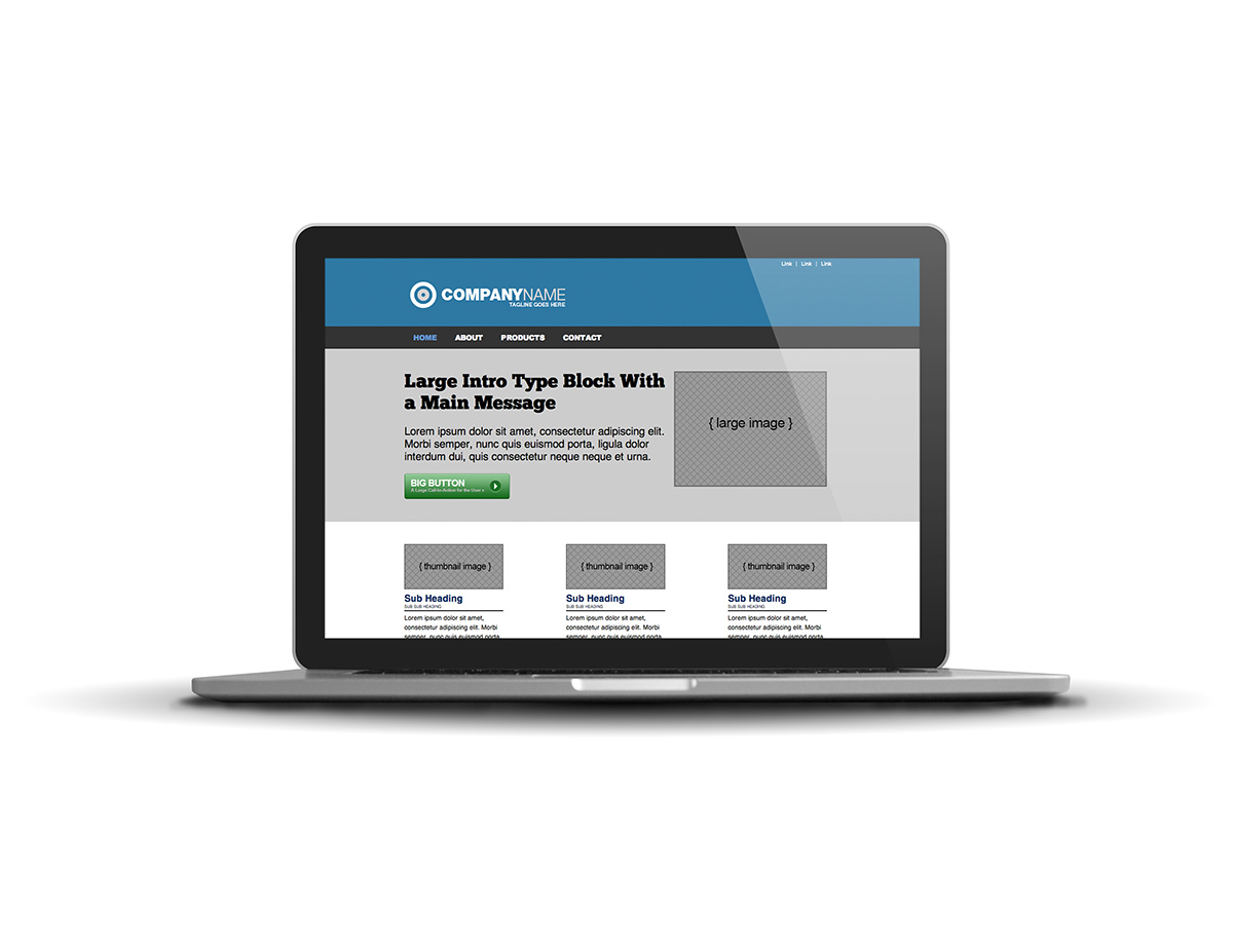
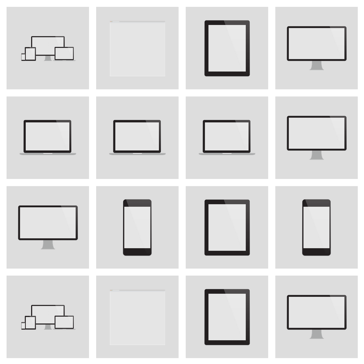
Flat view of UI Mockups
-
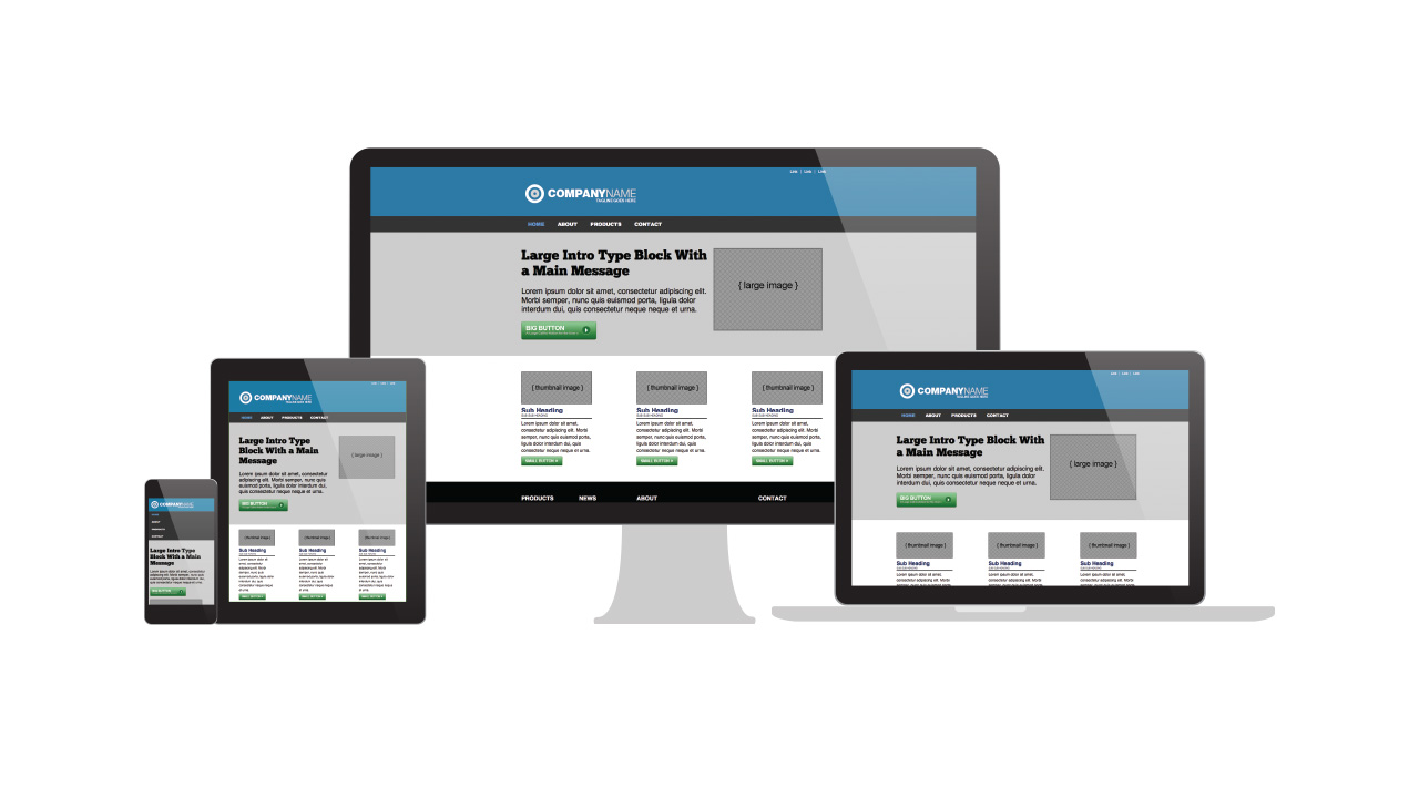
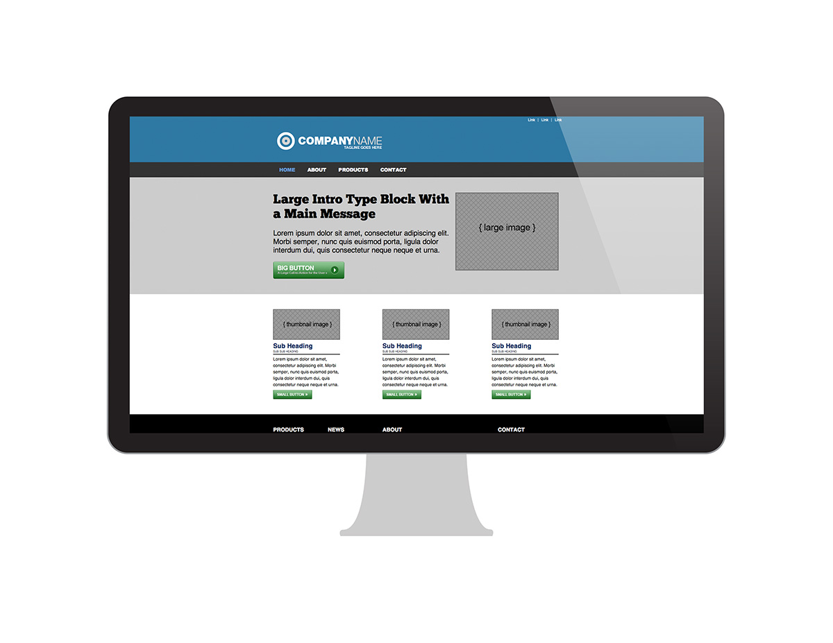
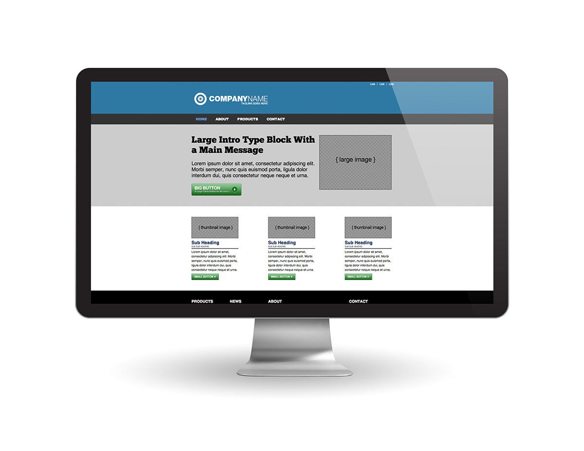
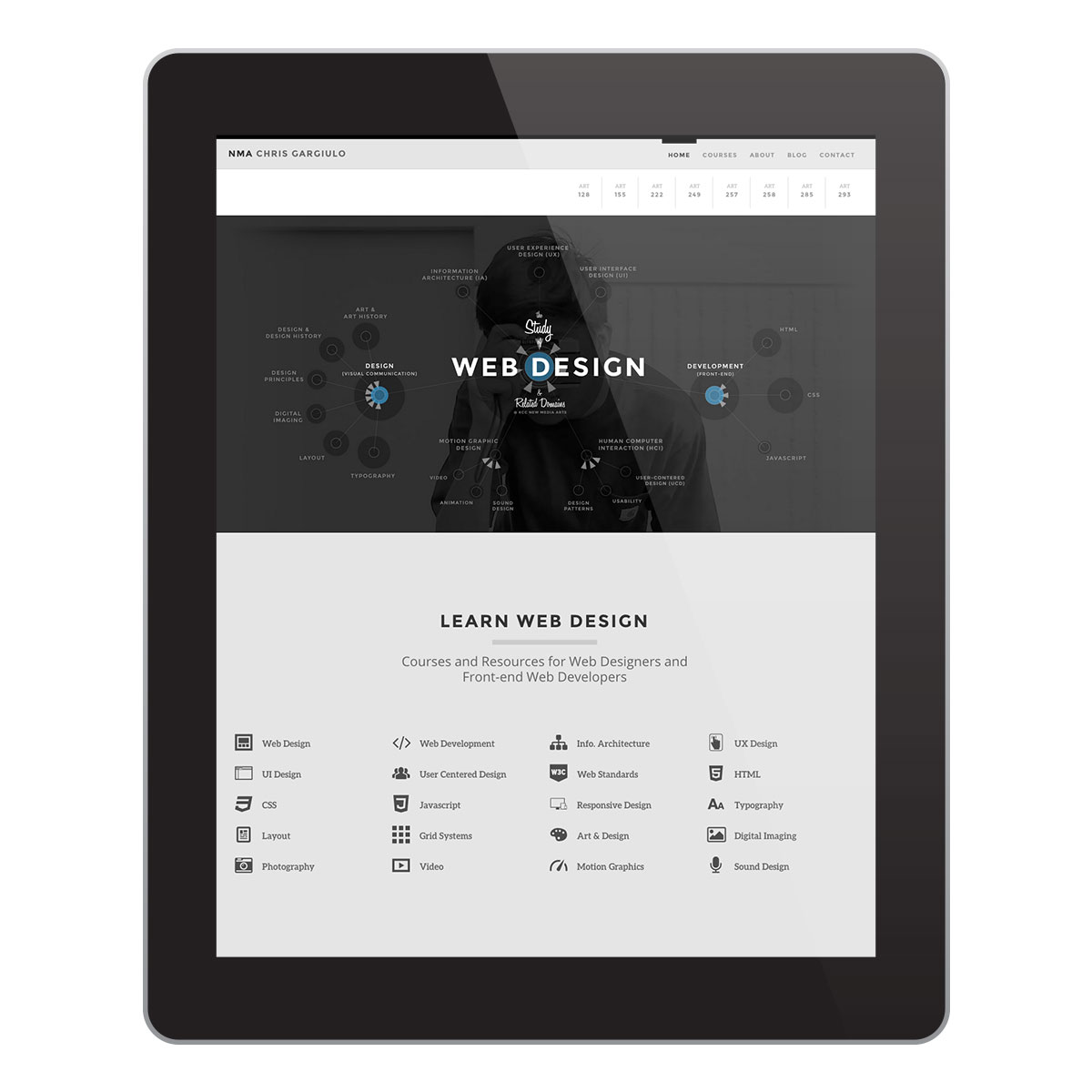
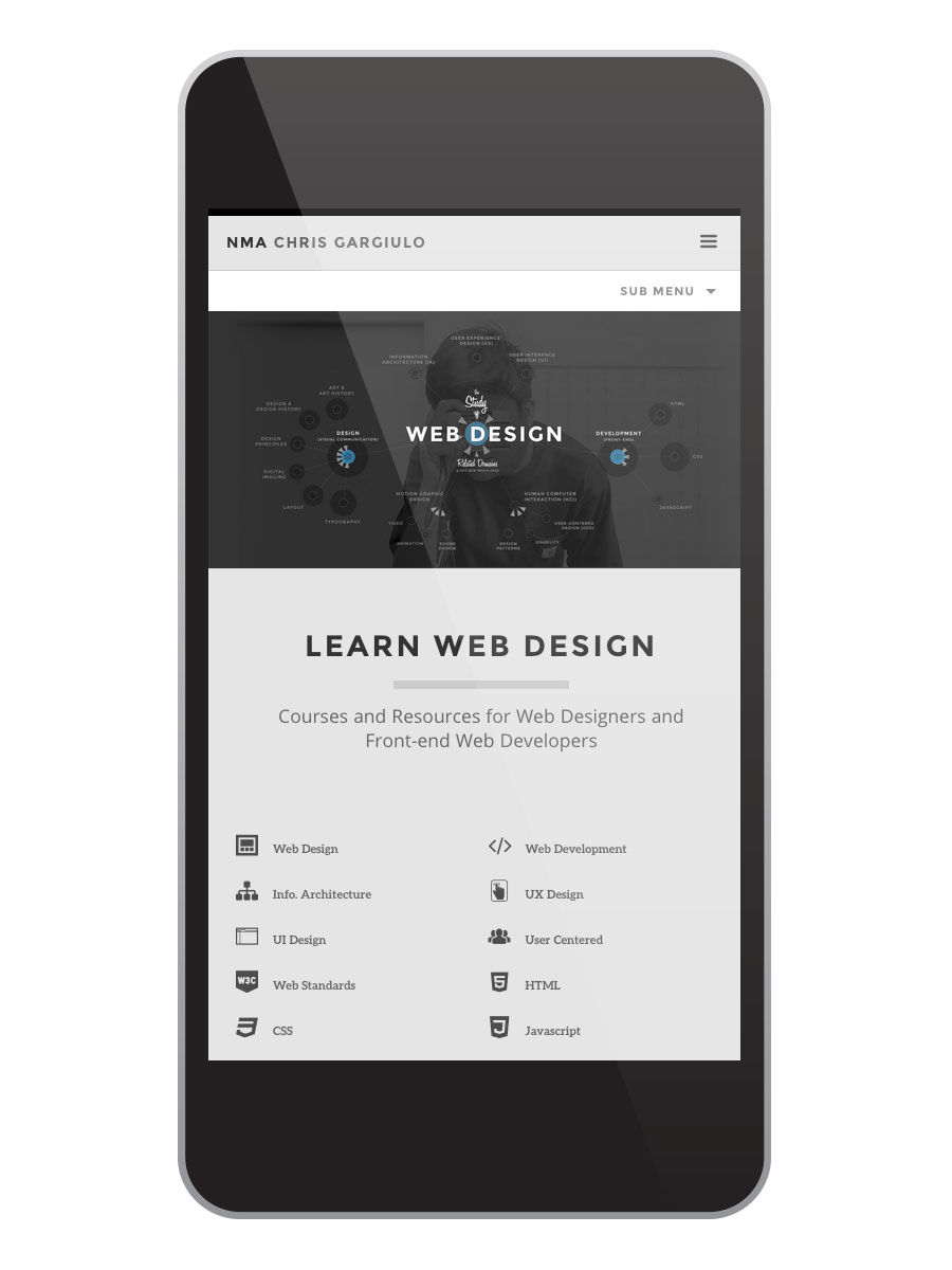
All Apple Devices
(The Responsive Hero Shot)
-
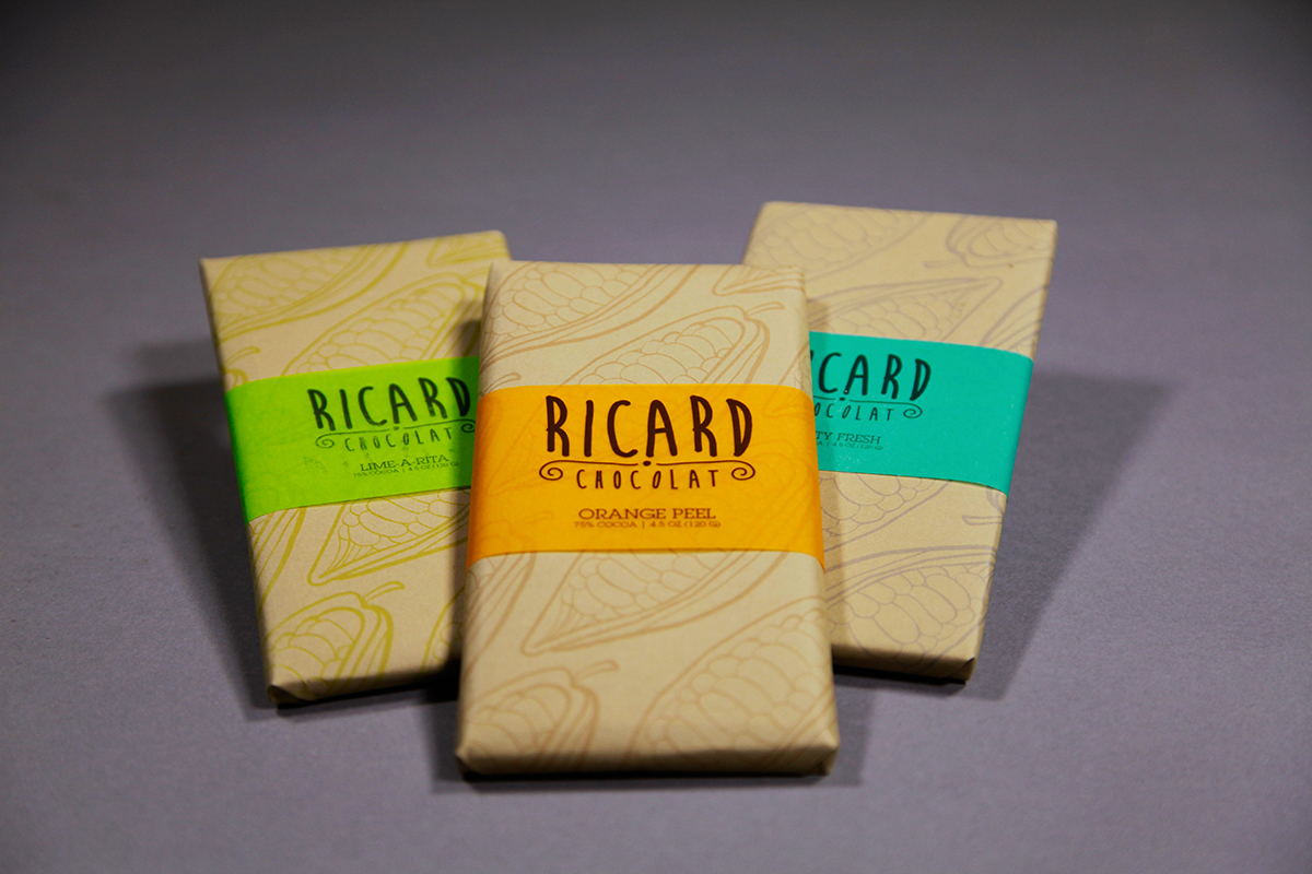
Custom Studio-lit Photos of Custom Packaging Media
-
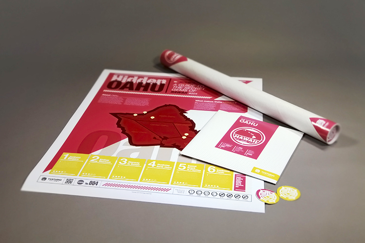
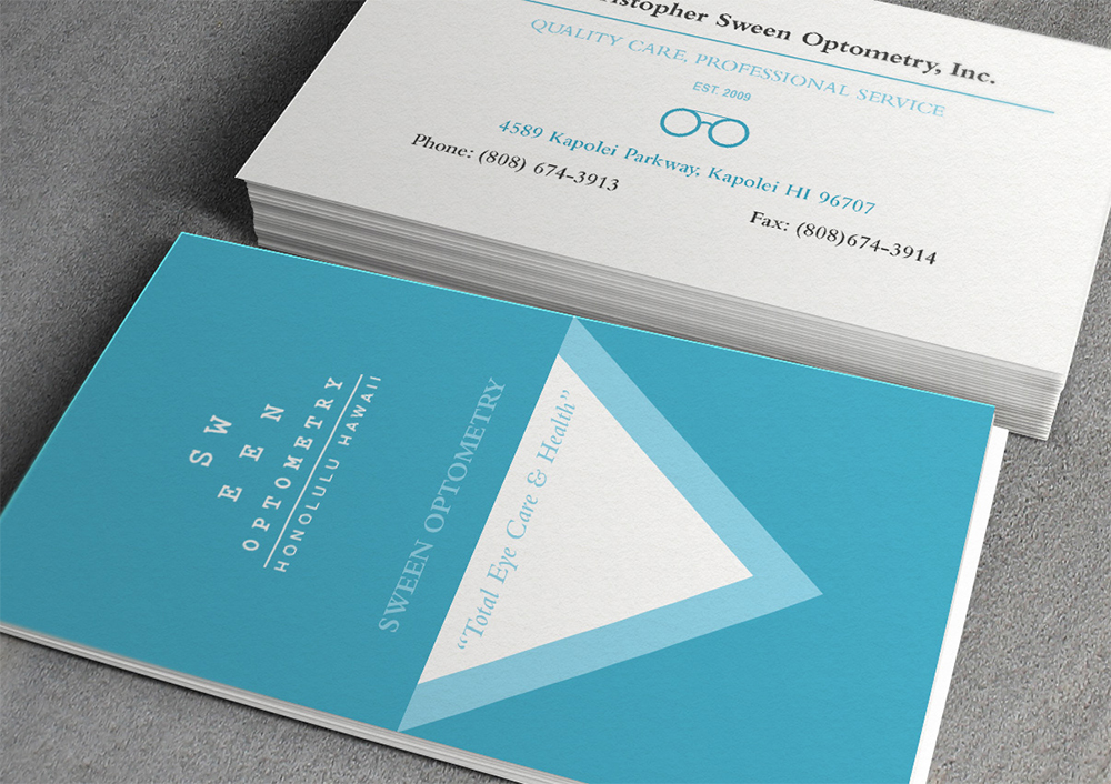
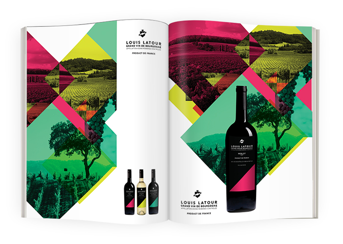
Custom Studio-lit Photos of Custom Printed Media
-
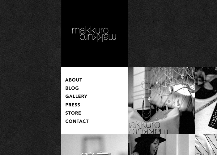
Cropped Flat for Detailed Close-ups
-
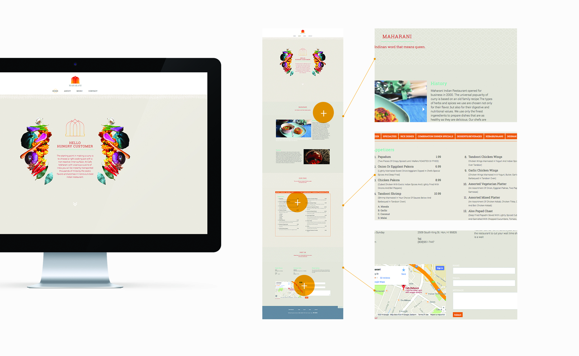
Full Views with Cropped Flat Zooms for Detailed Close-ups
-
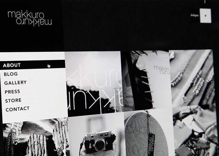
Skewed Photo for Detailed Close-ups
-
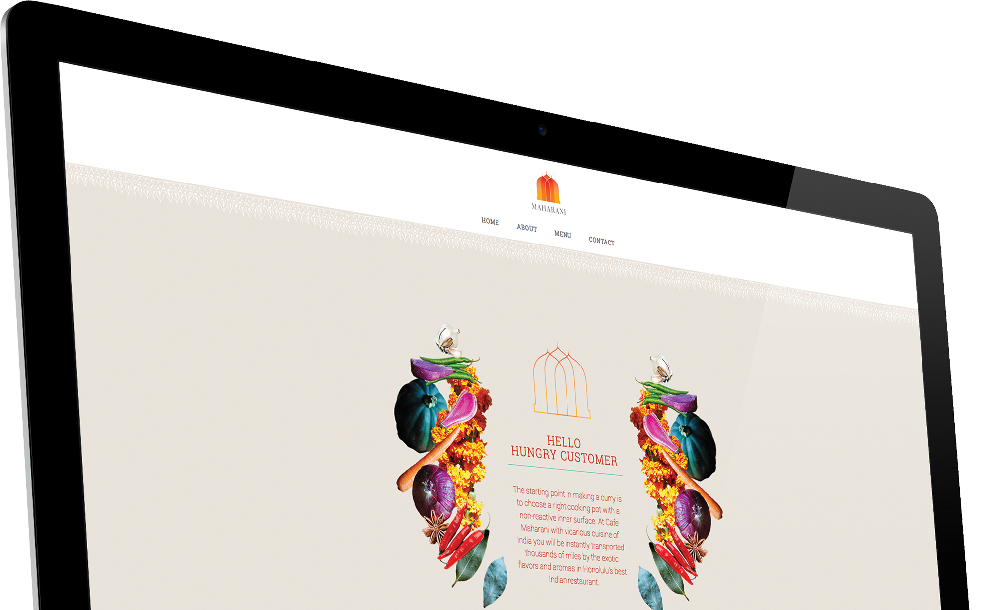
Skewed Mockup for Detailed Close-ups
-
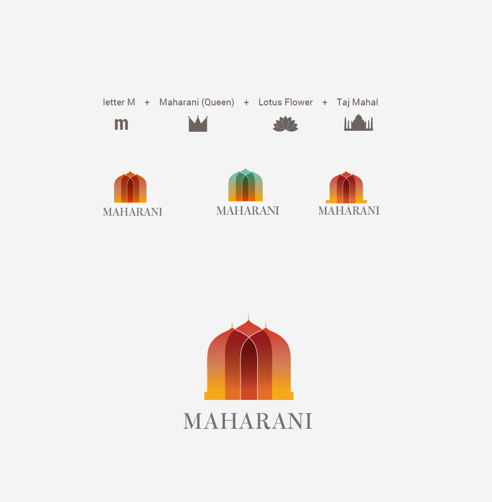
Process for Logos/Identity
-
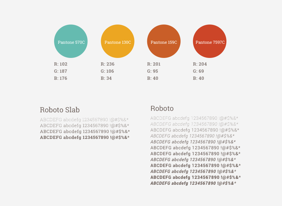
Process Studies (color, type, symbols)
-
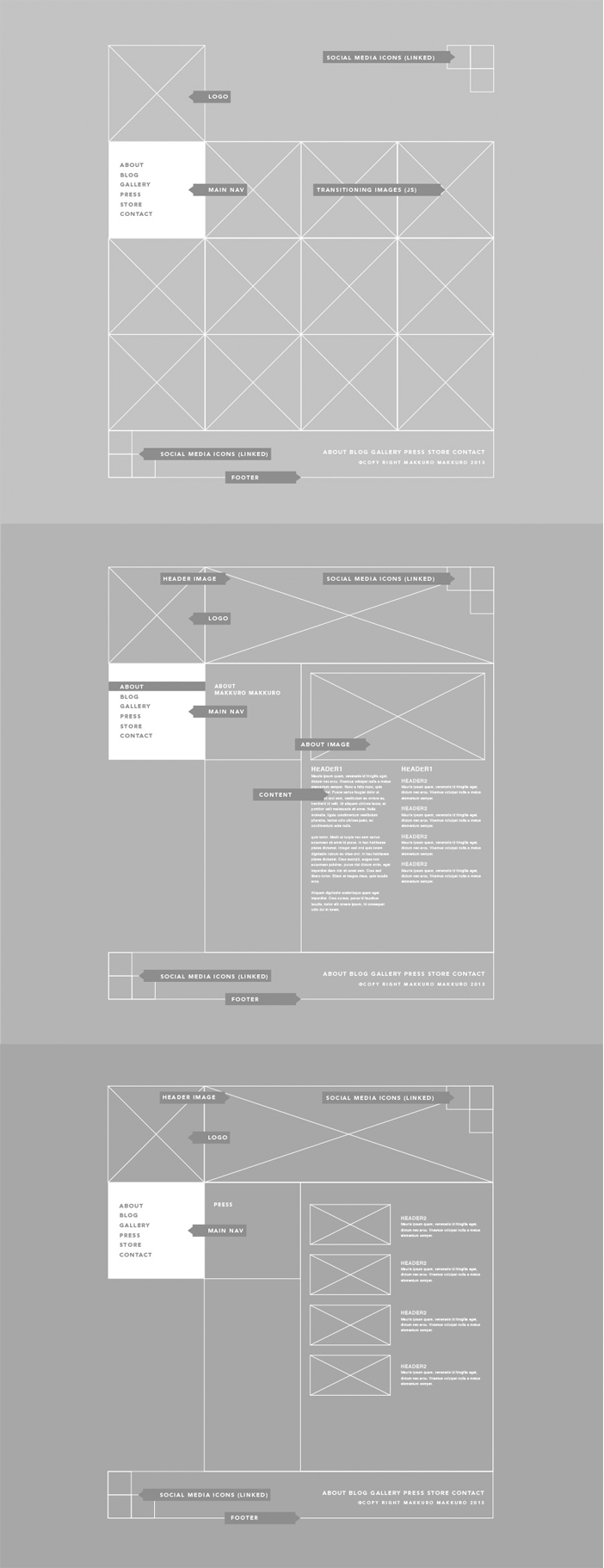
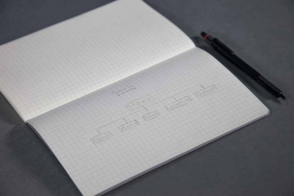
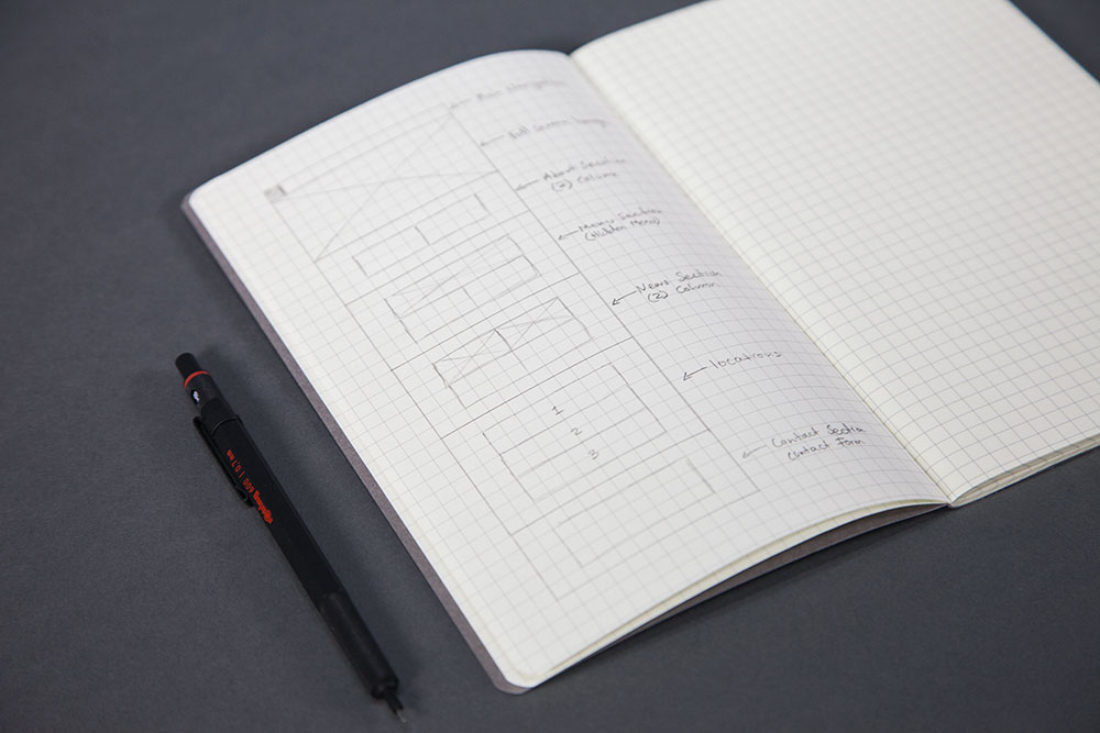
Process via Digitally Designed Wireframes
-
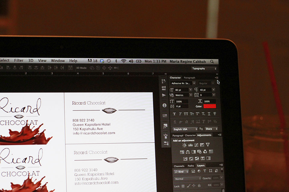
Photos of Open Adobe Files on a Computer Screen
-
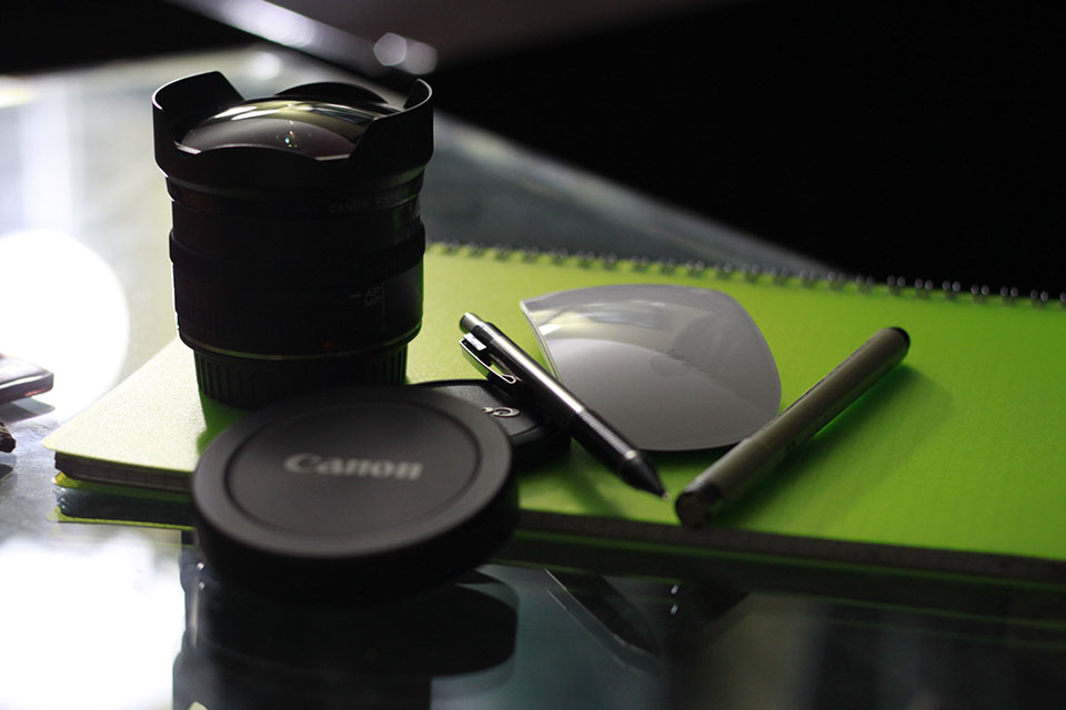
Photos of Design Tools/Toys
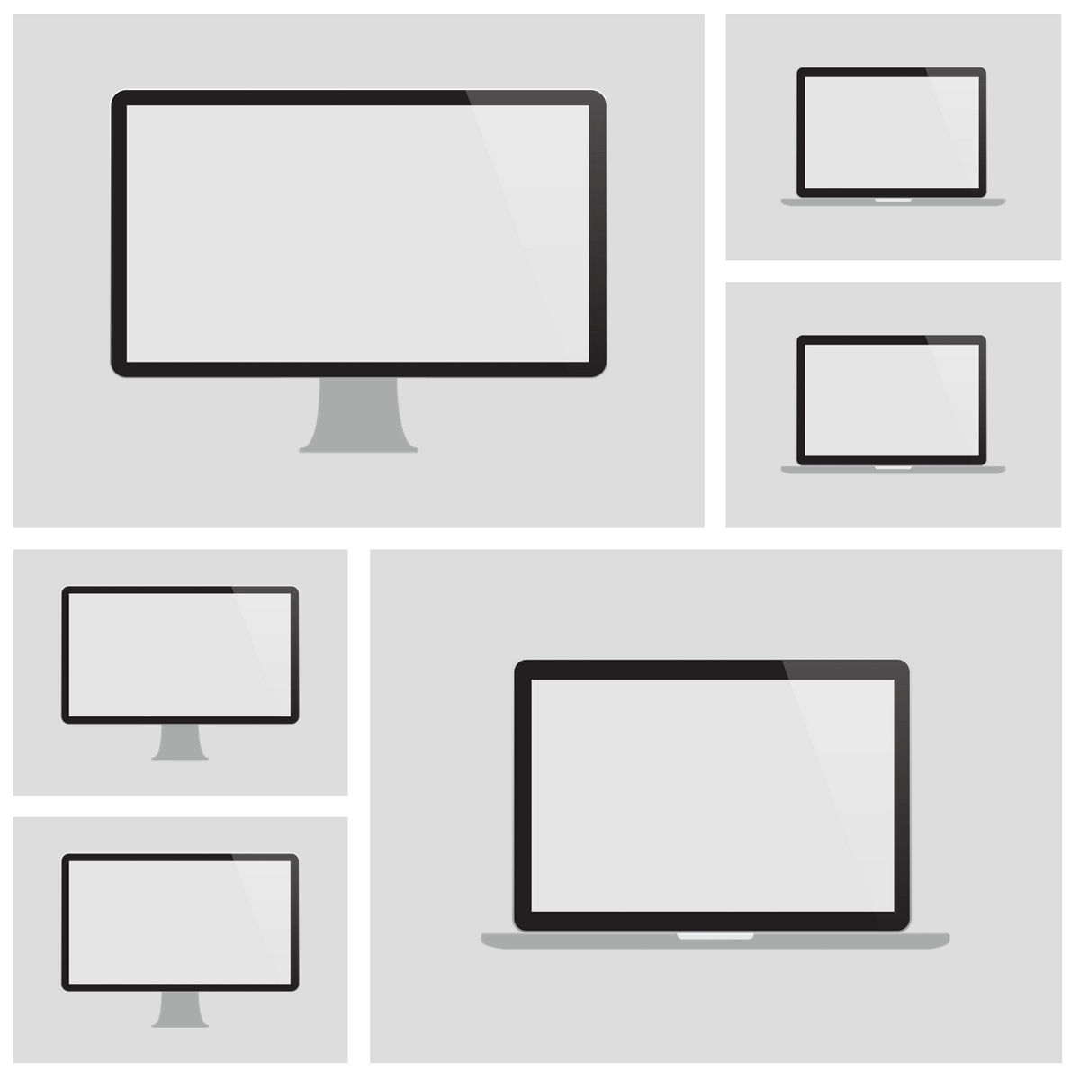
Grid Examples of Options to Consider
Examples of Portfolio Entries:
- John Doe's NMA 2.0 Web Project - [url]
- Alden's APB Web Project - [jpg]
- Rosie's Hanover & Pine Identity/Web/Print Project - [url]
- Hirona's Cafe Maharani Identity/Web Project - [pdf]
- Nainoa's PVS Identity/Web Project - [url]
- Cassy's MONO Web Project - [jpg]
- Callan's Goma Tei Web Project - [jpg]
Conclusion
An important part of being a designer is showcasing one's work. It is not an easy process that can consume the same, and sometimes more, time and attention that paid client work entails. As a healthy, reflective exercise, designers might enjoy putting themselves in the client shoes, and cater to their own needs for a change. When faced with a myriad of options, consider going the full design process to find the best design solutions.
