Interactive Wireframes
An Introduction to Coded Prototypes
by Chris Gargiulo
Traditional wireframes (flat images) and paper prototypes are great tools to communicate to both clients and internal team members how an interface might look structurally, but they can potentially fall short in both determining and communicating the user experience. One quick and efficient tool is to create interactive wireframes. They have multiple advantages, such as acting as an early prototype to help designers and developers determine best practices for increased usabiltity. It is also a great way to begin early technical tests with different front-end technologies and interface design patterns.
One of the challenges faced by user experience (UX) and user interface (UI) designers, is how does one figure out the best interface for users, when there might be multiple possible site structures, different content hierarchy options, and a wide range of styles, trends, and layout possibilities? One way of finding the best solution is to create a series of interactive wireframes, which are fully functioning early prototypes of the final product. The goal is to quickly and efficiently explore potential user experience solutions in an applied context without wasting too much time and cost.
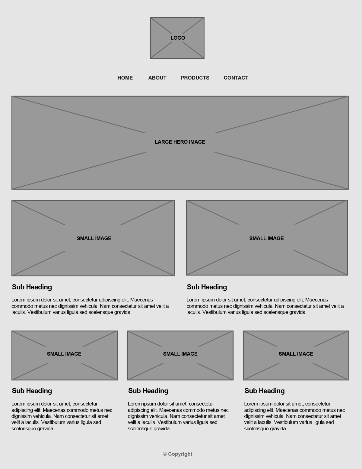
Ideally, wireframes should not dictate the layout or UI, so whenever possible they should be style independent, with less of a focus on the visual layout of the UI, and more of a focus on the site structure, content hierarchy, and user experience. Coding wireframes early in the design process enables both designers and developers to explore and discover solutions for little cost and risk. For aspiring designers and front-end web development students especially, tests are great for learning how to code early in design process, allowing the code to influence the design decisions, and vice versa.
Wireframes should be style independent, with less of a focus on the visual layout of the UI, and more of a focus on the site structure, content hierarchy, and user experience.
Creating Interactive Wireframes
How does one go about coding an interactive wireframe? There are no set rules or guides for how to properly create an interactive wireframe. Many designers and developers use front-end frameworks and boilerplates to speed up the development. My suggestion, especially for students who need more practice coding, is to code them by hand from scratch, using this general three-step process:
-
Site Map & Wireframes
Before you begin coding, make sure you have a traditional site map and wireframes (they don't need to be fancy - sketches are OK). -
A Strong Base
Start coding with a strong base (simple, semantic markup with initial base CSS styling for core elements such as the typography, headings, lists, links, and all media). -
Placeholder Content
Add placeholder content (placeholders for all images and most bodytext, use real content for the main nav items and main sections and headings)
Site Map & Wireframes
A Strong Base
Add Placeholder Content
Site Map & Wireframes
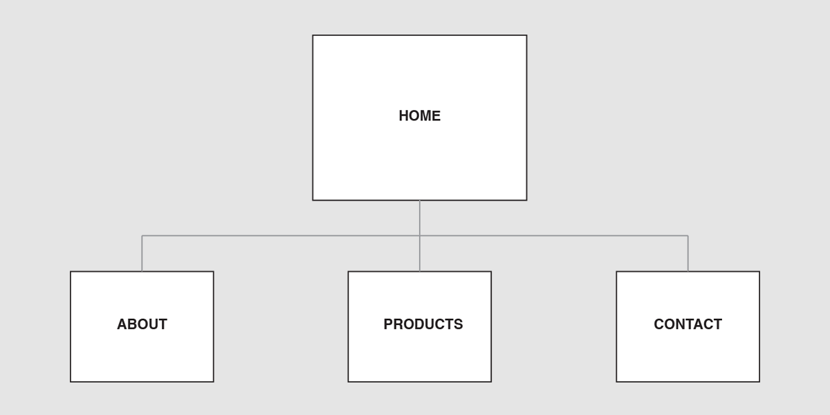
Site Map
How many pages total are there? How many nav items and what should we name each? A site map can answer these questions visually.
A Strong Base
HTML & CSS Base Test:
See the Pen Base HTML+CSS by kccnma (@kccnma) on CodePen.
Resources:
View Demo Download Source FilesHTML & CSS Base
What is the best way to start coding from scratch? What HTML/CSS code do front-end developers commonly repeat across multiple projects?
Add Placeholder Content
Sample Interactive Wireframe:
See the Pen Wireframe by kccnma (@kccnma) on CodePen.
View Demo Download Source FilesInteractive Wireframes
Starting with a solid base HTML & CSS document, add in placeholder images and content using semantic markup to communicate the overall site structure and content hierarchy. Use a simple grid system for the interface layout to enhance the content hierarchy and improve the user experience.
Conclusion
Interactive wireframes are an efficient prototyping tool for designers to help communicate the user experience early in the design process. The primary goal is to quickly and efficiently envision the end product in an interactive, applied context without wasting too much time and cost. For aspiring designers and front-end web development students especially, interactive wireframes are great for practicing hand-written code from scratch.
Student Examples:
Video Lessons
BASE HTML & CSS:
Interactive Wireframes:
Next Steps
Depending upon your site's content, IA, UI layout & design, features, and functionality, you can begin adding content and UX features gradually over time to your wireframes. One way of doing so early in the process is by creating wireframe tests. For example, with simple modifactions to the wireframe example above, one can create a single page web site test using third-party frameworks such as JQuery to add UX functionality and patterns such as animated anchors to sections and a responsive nav.

