Breadcrumb Navigation
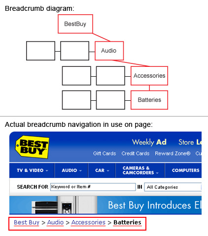
Breadcrumb navigation shows the user's path to their current location. Data below are from 75 leading e-commerce sites, collected in 2002 by Heidi Adkisson and in May, 2006, Apr, 2007 and Apr 2008 by KCC|NMA students. We examined the exact same sites that Heidi Adkisson studied in 2002.
Frequency of Breadcrumb Navigation: is it used?
| Data Comparison: | 2002 | 2006 | 2007 | 2008 | |
|---|---|---|---|---|---|
| Yes | 45% | 57% | 56% | 57% | |
| No | 55% | 43% | 44% | 43% |
Orientation of Breadcrumbs
| Data Comparison: | 2002 | 2006 | 2007 | 2008 | |
|---|---|---|---|---|---|
| Horizontal | 95% | 100% | 100% | 100% | |
| Vertical | 5% | 0% | 0% | 0% | |
In 2008, 100% of the sites that used breadcrumb navigation had it horizontally oriented.
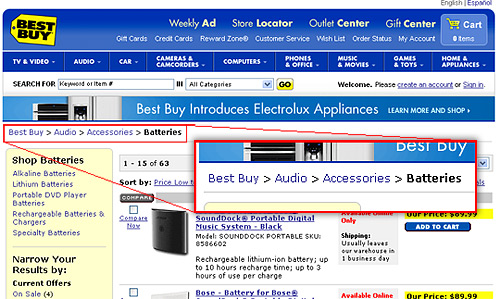
In 2002 5% of the sites included in this study used a vertically oriented breadcrumb navigation, yet in years 2006 to 2008 100% of the sites that used a breadcrumb navigation displayed horizontally. One disadvantage of using a vertical navigation is the amount of screen real estate that it can potentially take up. Depending upong the depth of a site, the character length of each sub section, and the style of how each is differentiated from each other (i.e. in an outline form one may use an indentation, or tab space, to demonstrate a nested element) a vertical breadcrumb navigation can grow both in width and height. Horizontal breadcrumb navigation systems, on the other hand, grow in width, with little growth in height regardless of the depth of a site.
Breadcrumb Separator (for Horizontal Breadcrumbs)
| Data Comparison: | 2002 | 2006 | 2007 | 2008 | |
|---|---|---|---|---|---|
| Right Arrow | 65% | 80% | 77% | 77% | |
| Colon | 8% | 7% | 5% | 7% | |
| Slash | 4% | 5% | 5% | 7% | |
| Pipe | 9% | 2% | 7% | 5% | |
| Bullet | 9% | 2% | 0% | 0% | |
| Left Arrow | 9% | 2% | 2% | 0% | |
| Semi-colon | 9% | 2% | 2% | 0% | |
| Dot | 0% | 0% | 2% | 0% | |
| Left Double Arrow | 0% | 0% | 0% | 2% | |
| Backslash | 0% | 0% | 0% | 2% |
In 2008, 77% used Right Arrow
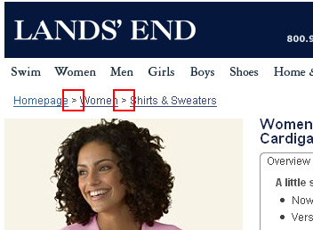
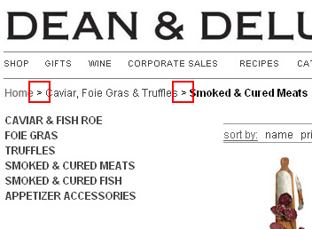
As you can see from the above examples, in 2008 77% of sites studied used a right arrow, or a right-pointing character, to denote a nested direction. Characters and symbols that do not give an indication of direction appear to be used less frequently. The English language is read from left to right, allowing horizontal breadcrumb navigation systems to be deciphered naturally and intuitively, easily demonstrating nested relationshiops without indenting. It is interesting to note that 2% of the sites that used breadcrumb navigation used left double arrows which go against the normal flow of reading but it directs the users to the path where they came from.
In 2008, 2% used Left Double Arrow
