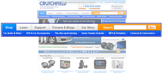
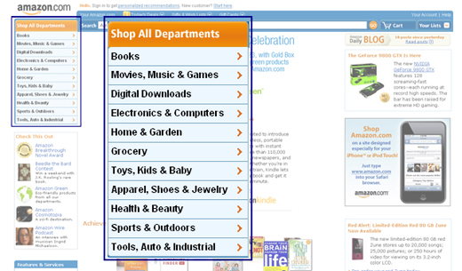
Global Navigation
According to Heidi Adkisson's webdesignpractices.com Global Navigation is defined as "links to a site's top-level categories that occur on every page of the site."
Data below are from 75 leading e-commerce sites, collected in 2002 by Heidi Adkisson and in May, 2006, 2007 and 2008 by KCC|NMA students. We examined the exact same sites that Heidi Adkisson studied in 2002.
Frequency of Global Navigation
| Data Comparison: | 2002 | 2006 | 2007 | 2008 | |
|---|---|---|---|---|---|
| Percentage of sites with Global Navigation | 97% | 99% | 93% | 100% |
Global Navigation appears to be very popular and effective usability feature that is so common that we have found it to be a "de-facto standard" according to Jakob Nielsen's rules for identifying standards in web design as stated in his article "When Bad Design Elements Become the Standard". In 2008, it has become the standard for all of the websites we reviewed.
Location of Global Navigation
| Data Comparison: | 2002 | 2006 | 2007 | 2008 | |
|---|---|---|---|---|---|
| Top | 89% | 85% | 86% | 94% | |
| Left | 11% | 13% | 4% | 6% | |
| Main Content Area | 0% | 2% | 3% | 0% | |
| Main Content Area | 0% | 2% | 7% | 0% |
94% Top:

6% Left:

Style for Global Navigation
| Data Comparison: | 2002 | 2006 | 2007 | 2008 | |
|---|---|---|---|---|---|
| Navigation Bar | 39% | 38% | 33% | 32% | |
| Navigation Tabs | 43% | 27% | 17% | 20% | |
| Plain List | 7% | 25% | 7% | 11% | |
| Pull Down Menu | 5% | 5% | 0% | 0% | |
| Navigation Buttons | 4% | 5% | 4% | 1% | |
| Pop-out/flyaway | 0% | 7% | 31% | 36% | |
| N/A | 0% | 0% | 8% | 0% |
As you can see in the above table, the percentage of navigation bars has decreased slightly and navigation tabs have gone into a slight incline in 2008, while the popularity of pop-out and flyaway menus, which allow a user access directly to deeper levels of a site from any page, have gone up.
Link Treatment within the Global Navigation: Link Style
| Data Comparison: | 2002 | 2006 | 2007 | 2008 | |
|---|---|---|---|---|---|
| HTML text (not underlined) | n/a | 45% | 28% | 29% | |
| Graphic text | n/a | 44% | 49% | 60% | |
| HTML text (underlined) | n/a | 11% | 12% | 10% | |
| Graphic text/HTML text (underlined) | n/a | n/a | 1% | 0% | |
| Graphic text/HTML text (not underlined) | n/a | n/a | 3% | 1% | |
| N/A | n/a | n/a | 7% | 0% |
In the above table we decided to expand upon Heidi Adkisson's study to include link treatment for global navigation links Graphic text/HTML text underlined as well as not underlined. In 2008, the use of Graphic text has increased by a fair amount, and the use of Graphic text and HTML has almost completely dimished.
Link Treatment within the Global Navigation: Link Rollover Behavior
| Data Comparison: | 2002 | 2006 | 2007 | 2008 | |
|---|---|---|---|---|---|
| None | n/a | 35% | 39% | 23% | |
| Change text color | n/a | 24% | 13% | 16% | |
| Change background color | n/a | 17% | 11% | 6% | |
| Add underlining | n/a | 12% | 7% | 8% | |
| Change graphic state | n/a | 12% | 21% | 31% | |
| Add underline/Change text color | n/a | n/a | 4% | 4% | |
| Change text color/Change BG color | n/a | n/a | 3% | 12% | |
| Inconsistent | n/a | n/a | 1% | 0% | |
| N/A | n/a | n/a | 1% | 0% |
In the above table we decided to expand upon Heidi Adkisson's study to include link treatment for global navigation links, adding underline/change text color, change text color/change background color, as well as sites that had an inconsistency. The use of rollover states are becoming more common, changing the graphic state and changing the text color/background color are the most popular way to go.