ART 155

Information Architecture

@ KCC New Media Arts
ART 155

Information Architecture

Intro to User Experience Design

Teacher: Chris Gargiulo

Information Architecture (IA) and User Experience Design (UX) embrace important User-Centered-Design (UCD) principles to help improve the usability of all interactive systems. IA and UX consist of multiple exercises to help designers to get to know their users and design the best possible interfaces for them. Methodologies and practices include defining user profiles, goals, and tasks and employing approaches such as content-first.

Information Architecture is the study of the organization and presentation of content for interactive web sites. Students learn how to structure complex information systems; to set meaningful usability goals; to define navigational menus that site visitors will immediately understand; and to design a site to meet the needs of target audiences.

Course Content

The Schedule

Points
Grade
100
Define
20%
100
Draft
20%
100
Design
20%
100
Final
20%
100
Crit
Crit
20%
500
1
2
3
4
5
6
7
8
9
10
11
12
13
14
15
16
100%

Grading System

20%
Definition Phase

Project Brief
100 Points

20%
Draft Phase

Conceptual Plan
100 Points

20%
Design Phase

Three Rounds of UI Designs
100 Points

20%
Final

Presentation
100 Points

20%
Class Participation

Critiques
100 Points

The Calendar

Calendar loading...

The Process

The Deliverables

Project Brief

Due: Week 2

100 Points

Conceptual Plans

Due: Week 5

100 Points

UI Designs

Due: Weeks 9, 12, & 15

100 Points

Final Presentation

Due: Week 16

100 Points

Lessons

What is a Project Brief? The Essentials To Starting a Design Project

A Brief Summary

A project brief is a practical and useful tool used as a first step in summarizing creative projects. It is used as foundational framework for developing strategic creative solutions to real-world project challenges.

Considerations
  • What is the primary design problem that needs to be solved?
Essential Elements to include
  • Project Name
  • Client Name
  • Brief Summary
  • Primary Objective(s)
  • Target Audience
  • Assets needed
  • Deliverables
Other Elements to consider
  • User Profiles (User Personas & Scenarios)
  • A list of key goals, features, functionalities, & technologies
  • Competitive Analysis (examples of competitor sites)
  • Precedents (similar examples to highlight/note)

How to Begin Planning? A Guide to Conceptual Planning

A Plan For Success

Conceptual plans are the blueprints for any design project. Conducted early in the design process, they can include any number of documents and exercises that will be helpful in communicating ideas to all stakeholders and instrumental in insuring a quality end product and user experience. The primary goal is to map out the project using a user-centered approach. Planning documents should try to be style/design independent, with a focus on the user's experience, goals, & tasks to help determine the best possible site structure and content hierarchy.

Considerations
  • Who is the user and why are they coming to this site?
  • For each page of the site, what information or content is the user looking for?
Essential Elements to include
  • Site Map
  • Wireframes
Other Elements to consider
  • A Content Document (containing all site imagery & copy)
  • Color Studies
  • Type Studies
  • Mood Boards
  • Prototypes & Interactive Wireframes
  • A series of tests (visual & technical)

Interactive Wireframes An Intro to Coded Prototypes

Wireframes

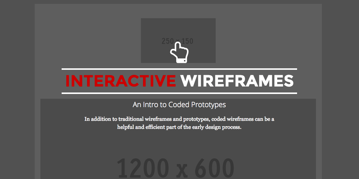
Traditional wireframes (flat images) and paper prototypes are great tools to communicate to both clients and internal team members how an interface might look structurally, but they can potentially fall short in both determining and communicating the user experience. One quick and efficient tool is to create interactive wireframes. They have multiple advantages, such as acting as an early prototype to help designers and developers determine best practices for increased usabiltity.

Considerations
  • What is the overall site structure and does this translate as a means of interface navigation?
  • What is the content hierarchy for each page (i.e. what content is most important to the user? what order should it be presented?)
Essential Elements to get started
  • Site Map
  • Wireframes
Lesson:
Wireframes Interactive Wireframes: An Intro to Coded Prototypes

Conducting Tests The Importance of Early Testing

Tests

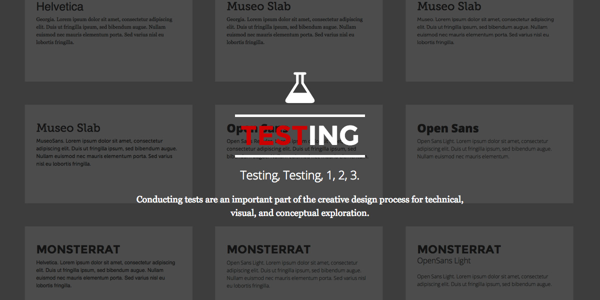
Tests are an important part of the design process for creative professionals such as UI/UX designers and front-end web developers. One of the challenges faced by many young design students, is how does one find the best solution to a particular design problem when there are multiple possible solutions? One way of finding the best solution is to conduct a series of tests early in the design process.

Considerations
  • What visual elements require exploration early in the design process?
  • What technologies might be potential solutions that need to be explored and tested early in the design process?
Example Tests to consider:
  • Typography Tests
  • Grid Systems
  • Design Patterns
    • Responsive Navigation
    • Sliders/Carousels
    • Modals/Lightboxes
  • Third-party solutions
    • Front-end Frameworks
    • Jquery Plugins
Lesson:
Tests Testing: The Creative Design Process of Conducting Tests
Week-by-Week

Week 1: Intro & Creative brief

Agenda:

  1. Introduction to the course
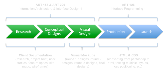
    • In this class we will go through in detail the early-to-middle phases of the design process of planning and designing web sites.
  2. Introduction to the primary project: Three Designs for one client.
    • You can choose any site that you want to work on (yes, you can choose a real-world client).
    • Your site must be relatively small (approx 4-5 pages in depth, no less).
    • You must do all research yourself and gather all content.
  3. We will take a look at student designs/interfaces from past years.

Presentation:

Class Overview - The Early-to-Middle Stages of the Design Process for Interface Design:

Class examples + related links:

Assignment: Choose a Client and Create a Creative Brief Due: Week2

  1. Set up your class web page.
  2. Purchase the required text for this course, Don't Make Me Think by Steve Krug, and read the intro & chapter 1
  3. Choose a company/organization for the web site that you will design throughout this course. Begin by conducting background research. Post your final choice, or a list of options, on your class web page.
  4. Once you have selected your site, create a creative brief document and post it on your your class web page for next week.
Week 2: User Profiles

Agenda:

  1. Go over the Creative Briefs
  2. Hot Studio - Brand, Content, & Visual Design Presentation
  3. Lessons:
    • User Profiles & Scenarios
    • Usability Goals, Checklists, & Heuristics
    • Brief Discussion of Browser differences
    • Forrester WSR tests (on Laulima)

Class examples + related links:

Assignment: User Profiles Due: Week 3

  1. If your client has an existing site, complete the full Forrester WSR test on your client site and post your score only (not the word document) on your class web page.
  2. Write up at least three user profiles, with user goals/tasks and user-site scenarios.
  3. Read the intro, Chapter 1, and Chapter 2 from Steve Krug's Don't Make Me Think.
Week 3: Functional Specifications

Agenda:

  1. "Features" Brainstorm session
  2. Lesson: What is a Functional Specifications Documents?

Class examples + related links:

Assignment: Functional Specifications Due: Week 4

  1. Create a functional specifications document. It should have three parts to it:
    1. a list of features in order of priority.
    2. a page-by-page description that includes a list of the content and features found on each page
    3. a user flowchart example visually depicting one way how a user may interact with the site
Week 4: Site Maps

Agenda:

  1. Introduction to Site Maps
  2. Quick lesson on how to create a site map
    1. Sketching
    2. Paper Prototyping
    3. Going Digital (ie. Microsoft Power Point, Illustrator, etc.
  3. The Client Pitch

Class examples + related links:

Assignment: Site Map Due: Week 9

  1. Create a site map for your client site. Bring a printed version to class next week, and post a PDF file of your site map on your UH class web site.
  2. Sketch, sketch, sketch!
  3. Consider paper prototyping (using paper/index cards to layout your site map).
  4. Read Chapters 3-5 from Steve Krug’s Don’t Make Me Think.
Week 5: WireFrames

Agenda:

  1. Walking Wall Critique Then On-Screen Critique of Site Maps
  2. Lesson: Wireframes

Lesson:

  1. Wireframes (also knownas “page maps” or “page schematics”)
    • Elements include:
      • Site ID (Logo)
      • Navigation (Primary, Secondary, Ultility, etc.)
      • Page Name (Think Steve Krug & Street Signs)
      • Sections of Content * imagery
      • Universal Sections (ie. Footer, Utilties, Internal Advertising, etc.)
    • How to begin creating a wireframe:
      • Sketch, Sketch, Sketch! (Do not start your layouts on the computer!)
      • Do not design with graphical elements,instead use simple lines to communicate the structure of a potential layout (not the visual style).
      • Think: “Heirarchy, heirachy, heirachy.”

Class examples + related links:

Assignment: Revised Site Map and Wireframes (Min. 3) Due: Week 6

  1. Based upon the feedback from the initial site map critique in class, revise your site map and post the revised version on your class web page.
  2. Create wireframes. Do as many wireframes as you see fit. You should have a minimum of three. For example, the home page, a sub page template, and at least one other sub pages that may not follow a templated layout, such as a gallery/photo page or a product listing page.
  3. Sketch, sketch, sketch before you work digitally!
  4. Read Chapter 6 from Steve Krug’s Don’t Make Me Think.
Week 6: UI Design - Round 1

Agenda:

  1. Intro to the visual mock-up design process
  2. Quick critique/review of revised sitemaps and wireframes

Lesson:

  1. Tips to Start Designing
    • Do plenty of research on visual style, color, patterns, technologies, and typesetting techniques.
      • Consider creating mood boards.
    • Do multiple sketches before you start designing digitally!!!
    • Work in Photoshop
      • The web is a screen-based medium, where the majority of web graphics are raster, not vector. We only see vector art in flash.
    • Create 3 separate Photoshop Documents (PSDs) - one for each thematic direction
      • Map out/decide on your thematic directions before you start designing. Your three thematic directions should include:
        • #1 a low risk design (ie. Prof/corporate)
        • #2 a mid risk design (ie. "fun-yet-functional")
        • #3 a high risk design (ie. experimental/wild).
      • Set up each document to be at least 1200 x 800 pixels, 72dpi. You may need to go larger depending upon your background design. The width of your layout/page (i.e. “container”) will depend upon each project’s goals & parameters.
      • Name them (think of a catchy name).
    • When designing (and coding), always working from the outside in and from the top down.
      For example, try to:
      • Design the background first
      • Then the container
      • Then the header
      • Then the navigation
      • Then the content imagery
      • Then the body content
      • Then the footer
    • Gather all Assets (ie. content & imagery)
      • My advice is to “work with what you got!”
        • At this point you may not have all of your assets, or your client may not have that many visual assets. This is your challenge as a designer. Solve it using your design skills!
    • Be sure to think about usability concerns such as:
      • The navigation & category naming conventions – should certain items be moved around, renamed, etc.
    • Lastly, have fun! Experiment with the visual layout, be creative, take risks!

Presentation:

Class examples + related links:

Assignment: Round 1 Designs Due: Week 10

  1. Start designing your three (3) visual mockups.
  2. Sketch, sketch, sketch before you work digitally!
Week 7: UI Design - Round 1

Agenda:

  1. Lesson: Design Patterns
    • A design pattern is a known solution to a commonly occurring problem in design.
    • A design pattern is not a finished product or piece of code, it is a concept/technique/solution.
    • A design pattern is a description/template for how to solve a problem that can be used in several different situations and in a variety of ways.

Class examples + related links:

Assignment: Round 1 Designs Due: Week 10

  1. Continue designing your three (3) visual mockups.
  2. Read Chapters 6-7 from Steve Krug’s Don’t Make Me Think.
Week 8: UI Design - Round 1

Agenda:

  1. Work week to continue working on the your round 1 designs.
  2. Take advantage of 1-on-1 support in class to ask for feedback on your designs.

Class examples + related links:

Assignment: Round 1 Designs Due: Week 10

  1. Continue designing your three (3) visual mockups.
Week 9: UI Design - Round 2

Agenda:

  1. Last work week to finish your round 1 designs.
  2. Take advantage of 1-on-1 support in class to ask for feedback on your designs.

Class examples + related links:

Assignment: Round 1 Designs Due: Week 10

  1. Last week to finish your three (3) visual mockups!
  2. Post all three designs on your class web page for review next week,
Week 10: UI Design - Round 2

Agenda:

  1. Midterm critique on both days.
    • 10-15 minutes per person to present.
    • Order will be determined via signup on the whiteboard on Tuesday at 1:45pm.

Critique Schedule:

Day #1 Day #2 Time
----- SETUP ----- 1:45-1:55
#1 #9 1:55-2:05
#2 #10 2:10-2:20
#3 #11 2:25-2:35
#4 #12 2:40-2:50
----- 10 Min. BREAK ----- 2:55-3:05
#5 #13 3:05-3:15
#6 #14 3:20-3:30
#7 #15 3:35-3:45
#8 #16 3:50-4:00
----- CLOSING REMARKS ----- 4:05-4:15

Assignment: Round 2 Designs Due: Week 13

  1. There is no homework over break, but if you are feeling ambitious, please consider the following:
    • Based upon the feedback from your Round #1 designs, begin making revisions and/or creating new designs for round 2.
Week 11: No Class - Spring Break
Week 12: UI Design - Round 3

Agenda:

  1. Lesson: how to improve your round 1 drafts.
    1. Create a game plan that includes a schedule of time that you will spend on each design.
    2. Make a list of design patterns/Web 2.0 features that you want to add to your designs.
    3. Typography, Typography, Typography.

Class examples + related links:

Assignment: Round 2 Designs Due: Week 13

  1. Based upon the feedback from your Round #1 designs, begin making revisions and/or creating new designs for round 2.
Week 13: UI Design - Round 3

Agenda:

  1. Informal Critique: Round 2 Designs.
  2. Lesson: how to post your round 3 designs in a client "comp site."

Class examples + related links:

Assignment: Round 3 Designs Due: Week 16

  1. Based upon the feedback from your 2nd round, make informed design changes to all your visual layouts, with the primary goal of choosing one to be the final design for your client, and rebranding the other two designs for new clients.
  2. Begin preparing an interactive client "comp site". See this example of a student comp site from last year or see John Doe's "Comp Site from Class" for a working example.
Week 14: UI Design - Round 3

Agenda:

  1. Lesson: how to rebrand two of your designs for round 3.
  2. Lesson: how to post your round 3 designs in a client "comp site."

Assignment: Round 3 Designs Due: Week 16

  1. Continue working on your three designs for three different clients in three different thematic directions.
  2. For the final design that you have chosen for your original client, continue enhancing your design by paying attention to the layout of the content. Consider adding Web 2.0 style elements.
  3. For your other two designs (the rebranded ones), first choose appropriate clients for rebranding that match the thematic design directions, then swap out content (ie. change the logo, update the navigation labels to match the new client’s site structure, swap out any primary photography, and switch out all content imagery and text).
  4. All three of your client designs must contain a home page and a minimum of three sub pages.
  5. Begin preparing an interactive client "comp site". See this example of a student comp site from last year or see John Doe's "Comp Site from Class" for a working example.
Week 15: UI Design - Round 3

Agenda:

  1. Lesson: Business tips for interface design.

Class examples + related links:

Assignment: Round 3 Designs Due: Week 16

  1. Continue working on your round 3 designs (three designs for three different clients in three different thematic directions - all three of your client designs must contain a home page and a minimum of three sub pages).
  2. Continue working on your interactive client "comp site".
Week 16: Final Presentation Design

Agenda:

  1. NO IN-PERSON CLASS ON TUESDAY! Instead, log onto Laulima to post questions.
  2. Informal Critique of Round 3 designs (to be conducted online and in-person on Thursday).
  3. Work week to finalize your designs in preparation for the final critique.

Class examples + related links:

Assignment: FINAL Designs Due: Week 17

  1. Based upon the feedback from your Round 3 critique, make any and all changes to produce FINAL quality visual mockups for all three clients including at least 3-4 sub pages per client. In other words, three total designs (home page + a minimum of 3 sub pages) for three different clients in three different thematic directions.
  2. Post your final designs as an interactive client "comp site".
Week 17: Final

Agenda:

  1. Final critique on both days.
    • 10-15 minutes per person to present.
    • Order will be determined via signup on the whiteboard on Tuesday at 10:45am.

Critique Schedule:

Day #1 Day #2 Time
----- SETUP ----- 1:45-1:55
#1 #9 1:55-2:05
#2 #10 2:10-2:20
#3 #11 2:25-2:35
#4 #12 2:40-2:50
----- 10 Min. BREAK ----- 2:55-3:05
#5 #13 3:05-3:15
#6 #14 3:20-3:30
#7 #15 3:35-3:45
#8 #16 3:50-4:00
----- CLOSING REMARKS ----- 4:05-4:15

About

This is the faculty web site for KCC New Media Arts instructor Chris Gargiulo. Chris is a designer, animator, and filmmaker with experience in print design, web design, front-end web development, motion graphics, and animation for various film, web, and multimedia projects. This site is for his students and for all who are interested in web design related topics and techniques.

Contact

For specific information about this site and the Interface Design concentration of courses within New Media Arts program at Kapi‘olani Community College, please contact:

Chris Gargiulo

Telephone: 808-734-9707
Email: gargiulo [at] hawaii.edu

For more general information about New Media Arts program at Kapi‘olani Community College, the Associates degree, and the admissions process to become a student, please contact:

Steve Harris

Telephone: 808-734-9510
Email: snharris [at] hawaii.edu
Chris Gargiulo KCC New Media Arts